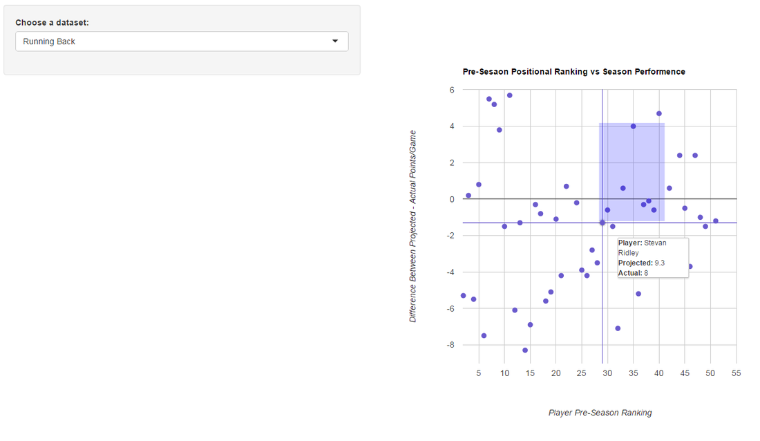
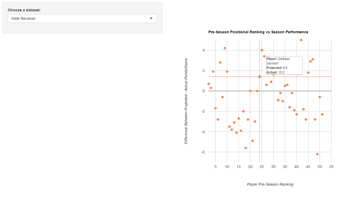
I created a small interactive visualization that illustrates how Wide Recievers and Running Backs performed last year on points per game basis versus their projection. I chose to do points per game as opposed to total points as injuries (for the most part) aren't something that can be projected so I felt points per game is a better indication of well a player performed. I figure I'd rather have a player that averages 14 points per game with 12 games played than a player with 11 points per game with 16 games played. I talk about the logic behind this toward the end of my 2015 Fantasy Football Preview .
Anyways, below is a link to the visualization I mentioned. I'm currently working on finding a free way to embed the visualization directly on this page, but for now just please follow the link.
https://athletametrics.shinyapps.io/ffb-corr
Here are a couple screenshots from the visualization:
Anyways, below is a link to the visualization I mentioned. I'm currently working on finding a free way to embed the visualization directly on this page, but for now just please follow the link.
https://athletametrics.shinyapps.io/ffb-corr
Here are a couple screenshots from the visualization:
 |  |
The visualization was made through RStudio's Shiny web application frameowrk along with GoogleVis.
 RSS Feed
