There haven't been any real analysis based updates in a while, and I assure its for good reason. Over the past week I've been putting together a tool that makes visualization of the tier based rankings easy. The tool was made via RStudio's Shiny package in conjunction with Plotly.
The tool can be found here:
https://athletametrics.shinyapps.io/tiers
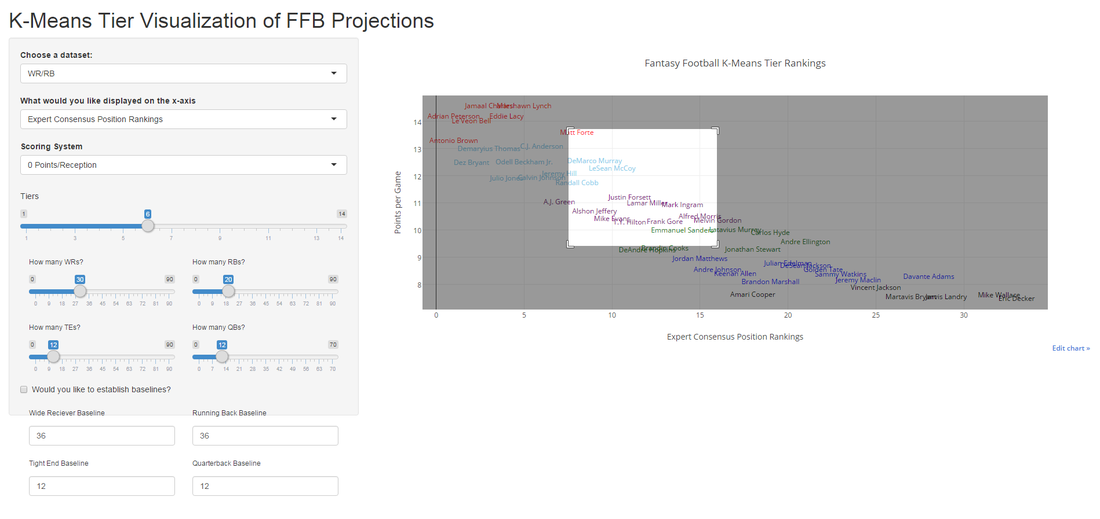
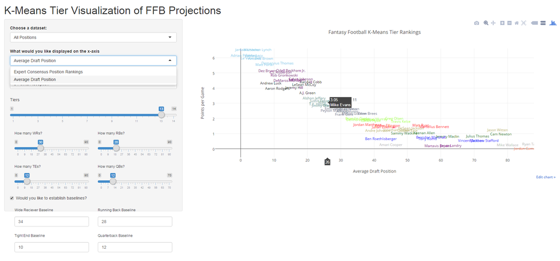
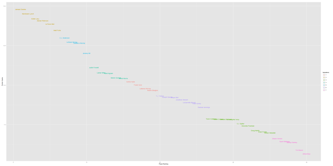
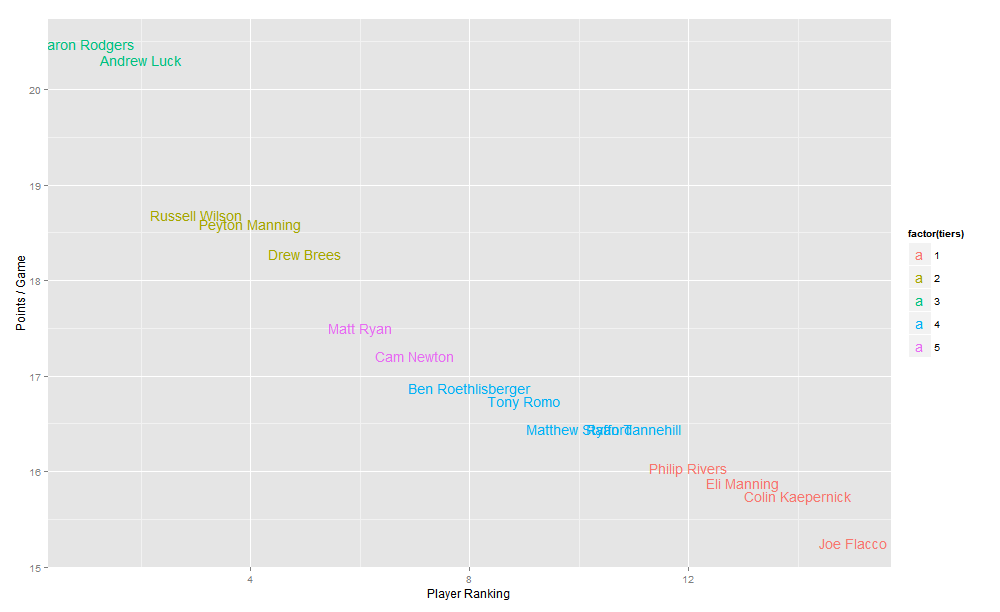
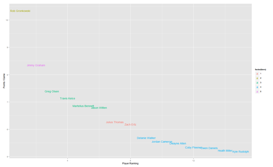
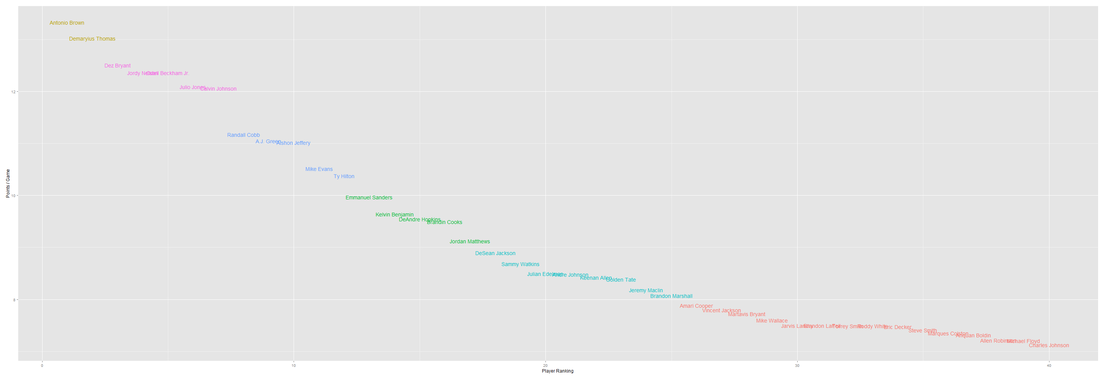
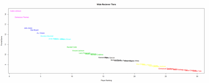
So it does the standard K-Means tier ranking I've been preaching on my blog (albeit with much better interactivity). The main features I'd like to highlight are:
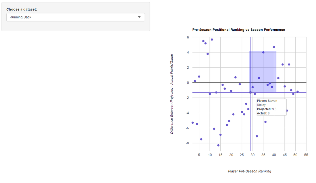
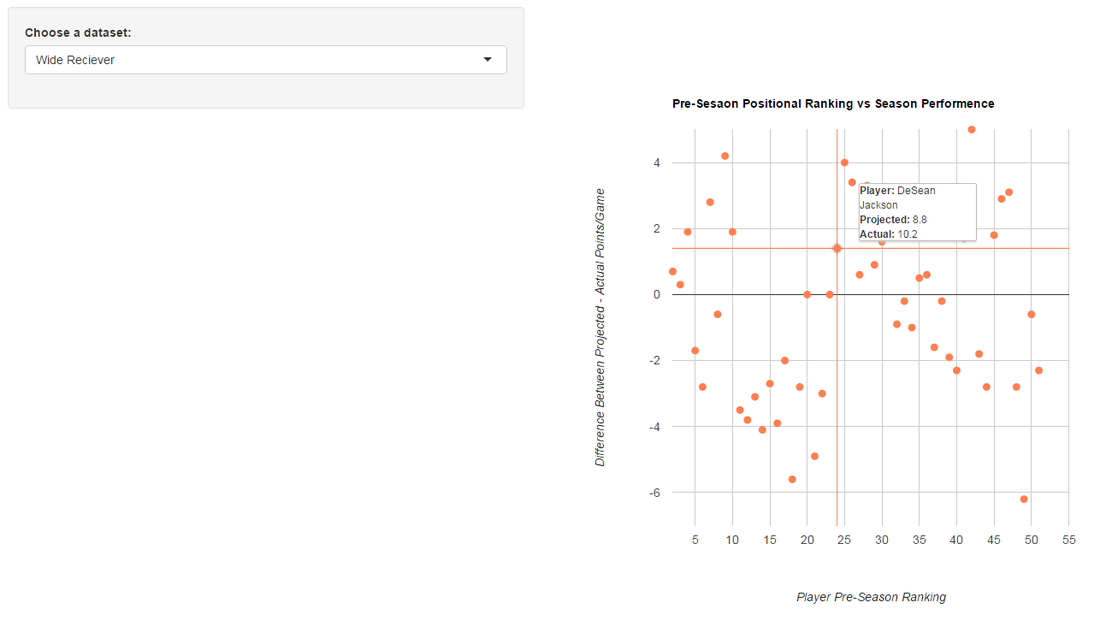
Usually I like to accompany these posts with some level of analysis, however the whole point of this visualization is to make the data easy to analyze. If I have to explain what the chart is saying, my visualization has failed. Anyways, I've attached a couple screenshots of the tool below. Please let me know if there are any other features you'd like added.
The tool can be found here:
https://athletametrics.shinyapps.io/tiers
So it does the standard K-Means tier ranking I've been preaching on my blog (albeit with much better interactivity). The main features I'd like to highlight are:
- The ability to toggle through different positions (as well combinations of positions such as WR/RB/TE)
- Other options include PPR and comparing ADP to expert consensus rankings
- You can now set "baseline" players as per the Value Based Drafting Approach. If you're unfamiliar, you can read more about it here
Usually I like to accompany these posts with some level of analysis, however the whole point of this visualization is to make the data easy to analyze. If I have to explain what the chart is saying, my visualization has failed. Anyways, I've attached a couple screenshots of the tool below. Please let me know if there are any other features you'd like added.
 |  |
 RSS Feed
